
Preparing for Flu Season
It is late spring 2018 and the country has been through an especially difficult season of influenza. To prepare for the next flu season, a medical staffing agency wants to use past data about influenza to determine when and where to best allocate their staff
Data Source
& Context
A hypothetical Medical Staffing Agency (MSA) provides temporary medical staff to hospitals and clinics around the United States to aid in the fight against influenza. This project uses real-world influenza data from the Centers for Disease Control (CDC) and the demographic data from the U.S. Census Bureau to help MSA make predictions for the upcoming influenza season.
Goals
Given the data provided,
Analyze seasonal trends to predict when to deploy supplemental staff.
Identify groups particularly at risk for flu-related complications or death.
Incorporate insights into a model predicting which states will most need help.
Tools
Excel
Tableau Public
Screencastify
Preparation
Translated requirements into a project plan.
Cleaned data for accuracy, consistency and clarity.
Transformed data (grouping, filtering, sorting, transposing, etc.).
Integrated data from multiple sources.
Derived new variables from existing data.
Analysis
Performed visual analysis using histograms, box-and-whisker plots, scatterplots and choropleth maps.
Checked for correlation between variables using linear regression.
Performed statistical hypothesis testing (two-sample t-test) .
Forecasted when and where support would be most needed.
Presentation
Used data storytelling principles to design and sequence visualizations.
Created an interactive Tableau dashboard that allowed stakeholders to filter and explore data by state or year.
Presented findings via recorded video presentation.
Results
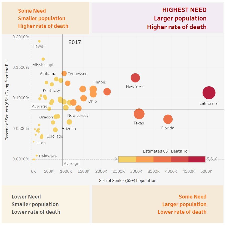
In 2017, senior citizens (aged 65+) made up only 15% of the population but suffered 94.8% of influenza-related deaths. Statistical hypothesis testing confirmed that those aged 65+ are significantly more likely to die of the flu than those under 65 (p-value= 5.7x10-157).

Clearly more help would be needed in states with a higher percentage of seniors. However, the rate at which citizens (and senior citizens) died due to the flu varied greatly among the states.
These factors, along with each state’s population size, were combined to create a model to predict the number of deaths, by state, for the next flu season.

Additionally, Tableau’s forecasting model was used to predict when the influenza season would hit and when staff should be deployed.

Visit the interactive Tableau dashboard to explore data further.

High Points
Tableau makes it easy to build visualizations that change based on filter settings, but I was especially proud of also designing some of the tool-tips and page text to be responsive to filters. The resulting story provided both interactive data and context as a result.

Challenges & Lessons
The biggest challenge was messy and incomplete data. In order to protect privacy, the CDC labeled 82% of the data points as “suppressed” because fewer than 10 deaths had occurred within a demographic. The population data provided by CareerFoundry was riddled with duplicates as well as missing roughly 11% of the expected values.
This project drove home the importance of sourcing the cleanest data possible. It also provided practice choosing the best way of addressing missing data to minimize the impact on the project outcomes.
Final Thoughts
Working with data that has life-and-death consequences requires both precision in the analysis and integrity in how the data is handled. In such cases, I believe that a team approach is best – more eyes on a problem means fewer potential mistakes.

Links for further exploration
Data profiles and summary statistics for
Population Data from the U.S. Census Bureau for 2009-2017
Influenza-Related Deaths Data from CDC for 2009-2017


MSA logo adapted from Vecteezy:
https://www.vecteezy.com/vector-art/13811850-health-medical-logo-template-vector
The photo of grandparents is from https://pixabay.com/photos/grandparents-grandmother-people-1969824/