Instacart Targeted Marketing
Instacart executives want to explore the data they have about their customers and sales patterns to find insights that will allow them to create targeted marketing campaigns for specific segments of their user base as well as promotions to increase usage during non-peak hours.
Data Source & Context
Instacart allows users to order groceries via the Instacart app and have those groceries delivered directly to their home.
Real order data is used with permission from Instacart. Fictitious customer and product data was added by CareerFoundry for the purposes of this project.
Goals
Questions to be answered include:
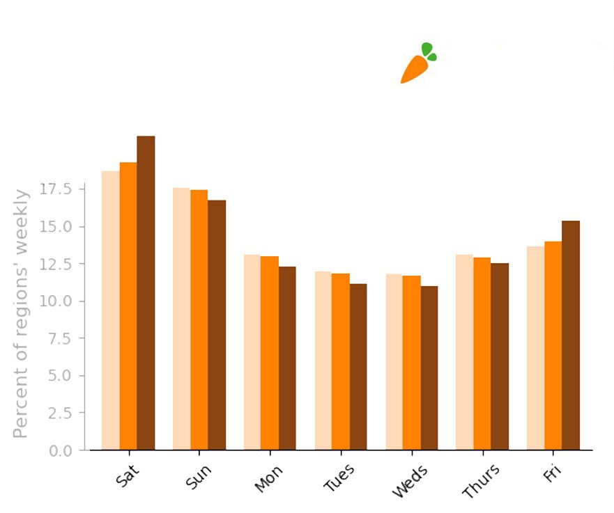
When are our busiest times of day/week?
Which types of products bring in the most revenue?
How does ordering behavior vary based on brand loyalty?
What profile groups should get targeted marketing?
Tools
Excel
Python, including Pandas, Numpy, Matplotlib, and Seaborn libraries.
Jupyter Notebooks
Preparation
Cleaned data for accuracy, consistency and clarity.
Wrangled data (adjusting datatypes, transposing, etc.).
Merged dataframes.
Derived new variables from existing data.
Documented changes and population flows.
Analysis
Filtered, sorted, grouped, and aggregated data to answer key questions.
Created new profiles/flags to enable marketing to specific segments within the customer base.
Performed exploratory analysis on each profile/flag to uncover additional insights.
Presentation
Selected and refined visualizations to ensure each key question was fully answered.
Provided a final report with both answers to key questions and recommendations based on new profile insights.
Results

Data analytics helped marketing know who to target and when to send out promotions.
For example, while ‘Loyal customers,’ represented only 8% of Instacart’s user base, they accounted for 31.7% of gross sales. Knowing when these customers are most likely to shop was valuable information for the marketing team. Additional analysis indicated that increasing the frequency with which new customers place orders would be key in helping them become ‘loyal customers.’

Additionally, close analysis of the data revealed that ‘pet owners’ and ‘parents of babies’ were two profiles worth targeting with special promotions. Each group was significantly more likely to be a loyal customer, spending more money and placing larger orders that other groups of customers.


High Points
Creating graphs in Python is easy, but creating polished visualizations with annotations is more challenging.
After some extra research, I was able to customize and polish my Matplotlib and Seaborn graphs and plots so that they made insights and trends easier to see.

Challenges & Lessons
One challenge was to identify which customer profiles marketing should target in order to increase revenue. I had to run a wide variety of tests on numerous different profiles in order to identify which ones would actually be more lucrative to target with marketing.
I created a script template that could be easily modified for each profile by updating just a few key variables. Taking the time to write more generalized code at the beginning of the process made it easier to reuse it and made it more efficient to explore a wider variety of profiles and find some really valuable insights.
Final Thoughts
Even though the customer data was fictitious, there was something very gratifying about being able to analyze a mass of data and extract insights that could potentially help the organization prosper.
